視角-形象視覺規劃|榮獲 Red Dot
|獲獎|
•新一代設計展2020金點新秀設計獎-贊助特別獎 視覺傳達設計類 Red Dot
|入圍|
•新一代設計展2020金點新秀設計獎-贊助特別獎 視覺傳達設計類
•2020 放視大賞-平面類 傳達設計組、平面類 創意企劃組
學 生:范翊玲、郭珮汶、郭歐妍欣
指導老師: 林雪雰
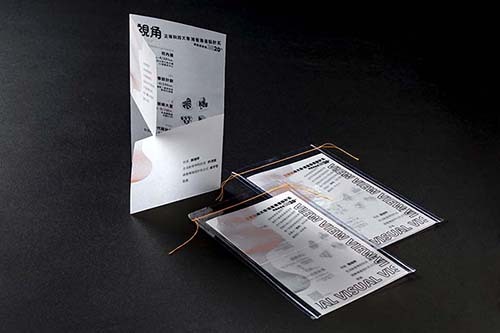
「視角」象徵轉換角度思考、突破自我。以線條構成視覺深度,結合螢光橘強調不斷向前的熱忱。用錯視原理設計四大領域圖形,代表多面向學習,轉匯不同視角探索設計的可能性。
DO YOU SEE VISION?
The view symbolizes the transformation of one's point of view and breakthrough. Lines are formed to achieve the visual depth. The fluorescent orange color emphasizes one's spirit of enthusiasm of moving forward. The principle of visual illusion is used to design the four major fields of Design, indicating the diverse learning and the possibilities of design transformed from different angles.