圍創-主視覺
|入圍|
• 新一代設計展2019金點新秀設計獎-贊助特別獎 視覺傳達設計類
• 2019 放視大賞-平面類 傳達設計組
學 生:曾芊瑜、李彥龍、邱語淇、吳怡馨
指導老師:陳江富、吳守哲
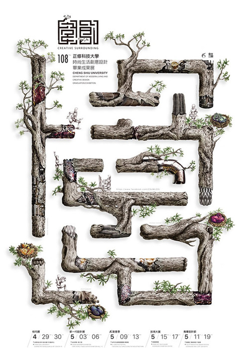
「圍創」,「圍」具有團結、圍繞之意,「創」則為創造、創意。選擇迷宮作為視覺意象,因學習過程猶如探索迷宮,充滿未知、挑戰、迷失與障礙,透過團結,便能使我們持續向前行,最後終找到屬於自己的出口。
以象徵本校辦學精神的「正修守護樹」構成迷宮的視覺元素,結合金工、立體構成、數位等元素,意喻本系的多元學習環境,四個出口處分別繪製象徵不同領域的彩蛋鳥巢,意喻著驚喜與收穫。
萃取海報視覺元素經重新分解及組合,分別應用在專刊、邀請卡及信封、宣傳卡、識別證、獎狀及感謝狀等周邊。識別證及宣傳卡特別將迷宮造型打凸,透過操控小珠子的滾動,完成迷宮關卡,增加互動性。立體周邊則將元素開發成實用的USB隨身碟及筆,及金銀銅等獎座。
CREATIVE SURROUNDING
Creative Surrounding, the theme means to make a creativity with the team. Using the maze to the theme, such as to explore the maze during learning. There are filled with unknown, challenges, lost and obstacles. We will keep going with our work and find out the advantages in the team by ourselves. The defend tree of Cheng Shiu is the element of the theme which is constructed in the maze. It is combined with metal, the structure of stereoscopy and digitalization, etc. It means it is an excellent place to learn anything at this department in school.The colorful egg of the bird's nest in the four different parts of the fields means surprise and reward from our scholarship.