


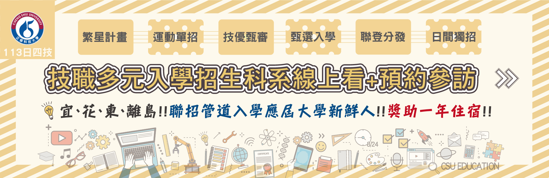
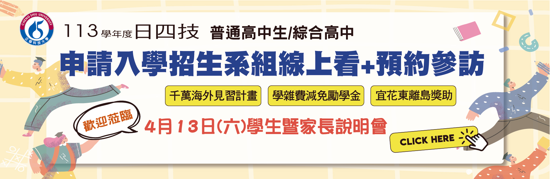
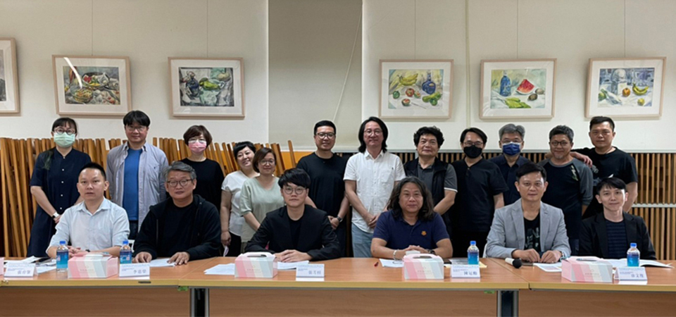
系所公告
|
2024/03/20
|
|
|
2024/03/11
|
|
|
2024/03/11
|
|
|
2024/03/05
|
|
|
2024/02/27
|
競賽訊息
|
2024/04/19
|
|
|
2024/04/08
|
|
|
2024/04/08
|
|
|
2024/03/26
|
|
|
2024/03/20
|
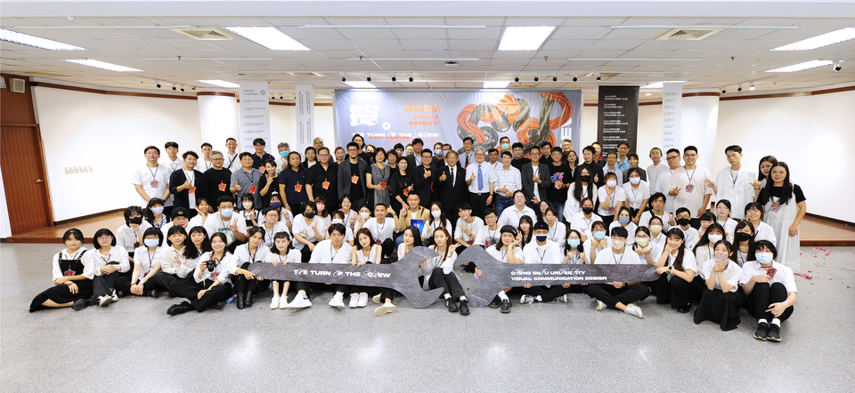
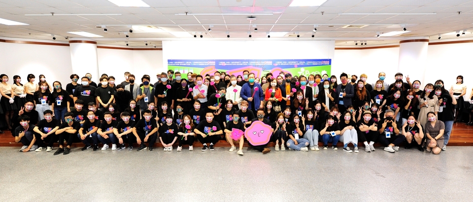
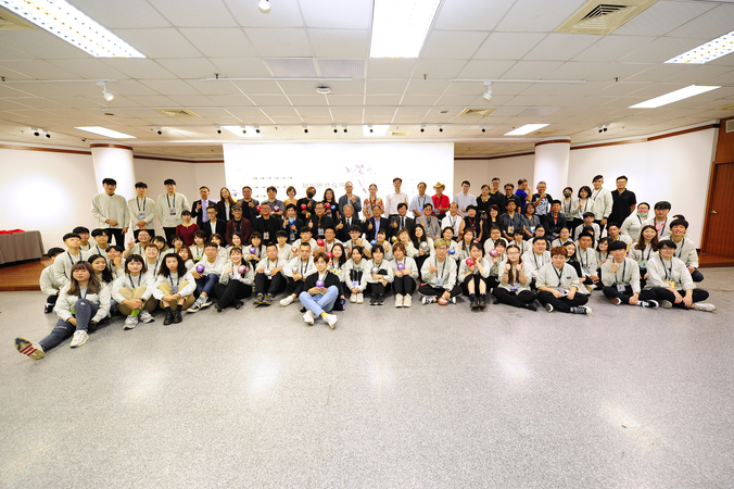
學生成果
本系課程提供「品牌與溝通設計」、「產品工藝研發」及「智慧與數位媒體應用」領域的發展鍊結。課程規劃側重基礎的知識學能訓練,力道於徒手繪畫表現技法、專業創作工坊實務操作與進階數位影音應用,再結合行銷企劃之概念,使設計創意轉化為具備產能之優質商品;此外,國內外知名專家講座研習與寒暑假的職場體驗也是學習的理之當然,藉此培育學生佳良的創造信念,讓學生們習有所專。
師生榮譽
|
2024/02/19
|
|
|
2024/02/19
|
|
|
2024/02/19
|
|
|
2024/02/19
|
|
|
2024/02/19
|
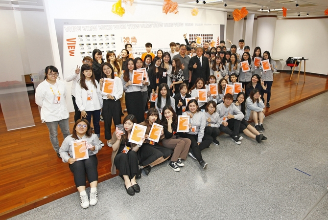
活動訊息
|
2024/04/08
|
|
|
2024/03/26
|
|
|
2024/02/23
|
|
|
2024/02/23
|
|
|
2024/02/23
|
焦點新聞
2023/10/10
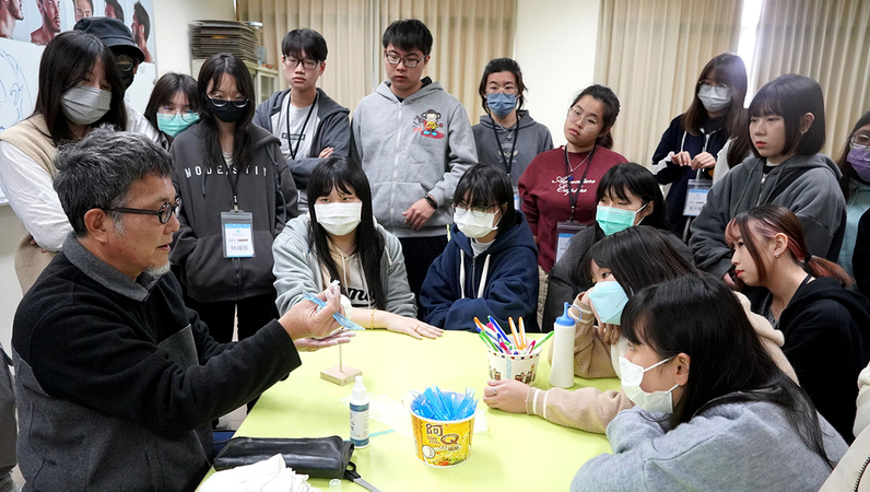
正修科大冬令營盛大登場!6系聯合出擊,視傳系打出「哇酷!玩具公仔設計」進行造型角色創作,學員感到既新鮮又有趣,收穫滿行囊。
2023/10/10
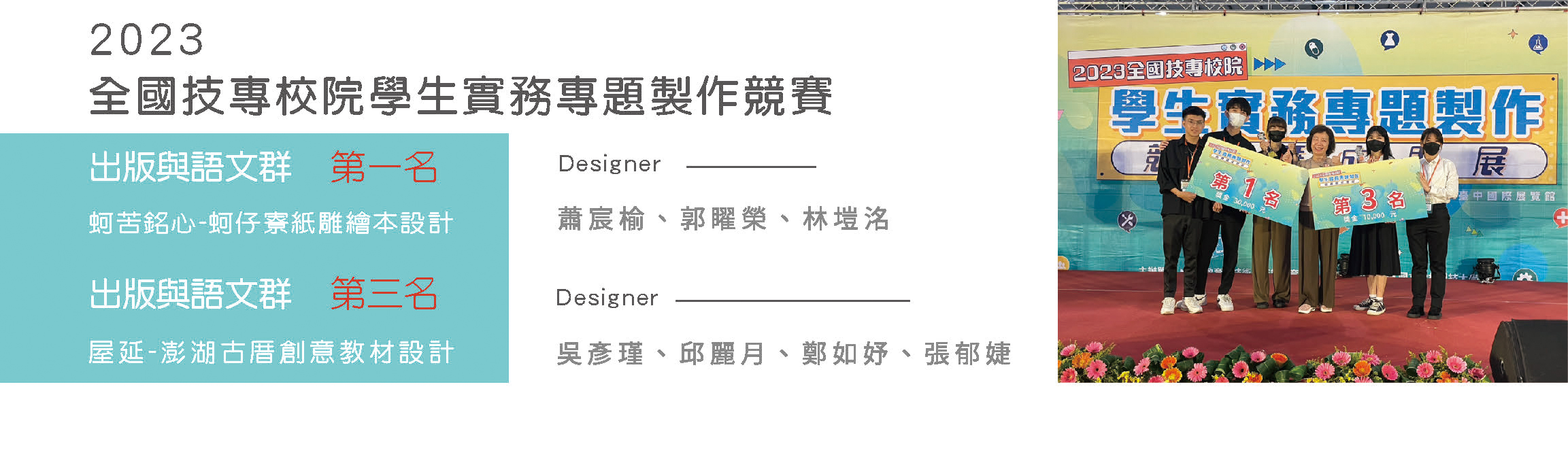
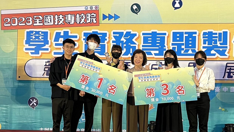
正修科大視覺傳達設計系畢業專題作品在最具技職教育指標的學生競賽「2023年全國技專校院學生實務專題製作競賽」,一舉摘下一、三名,消息傳回學校,全校師生與有榮焉,視傳系主任林育靚指出,精選參賽兩組作品雙雙入圍出版與語文群,獲獎率百分之百。
2023/10/10
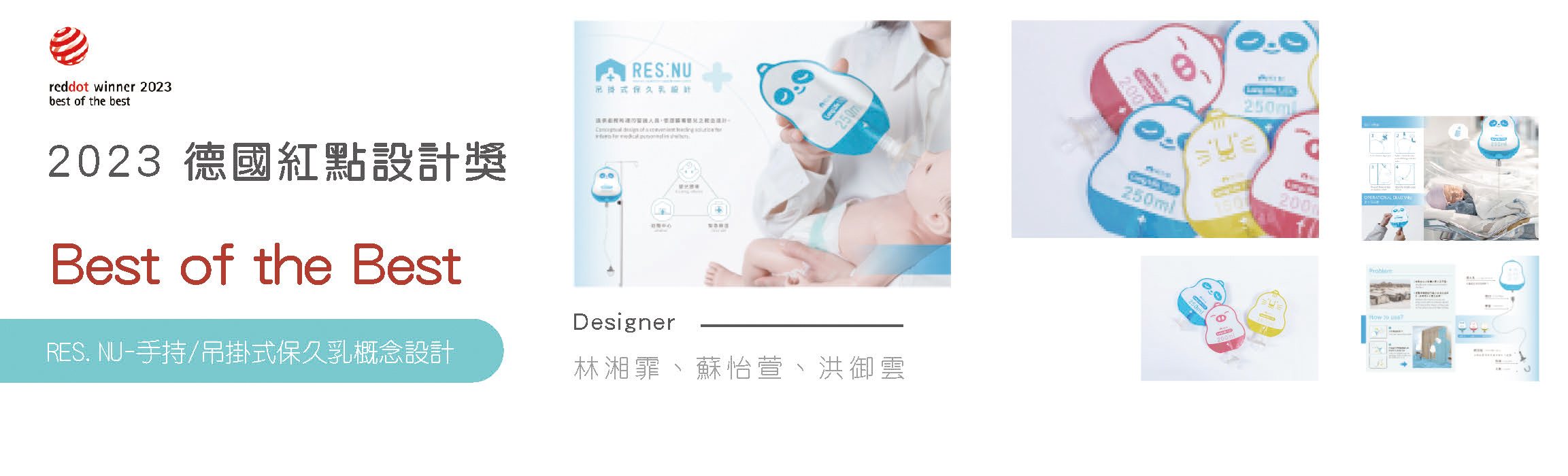
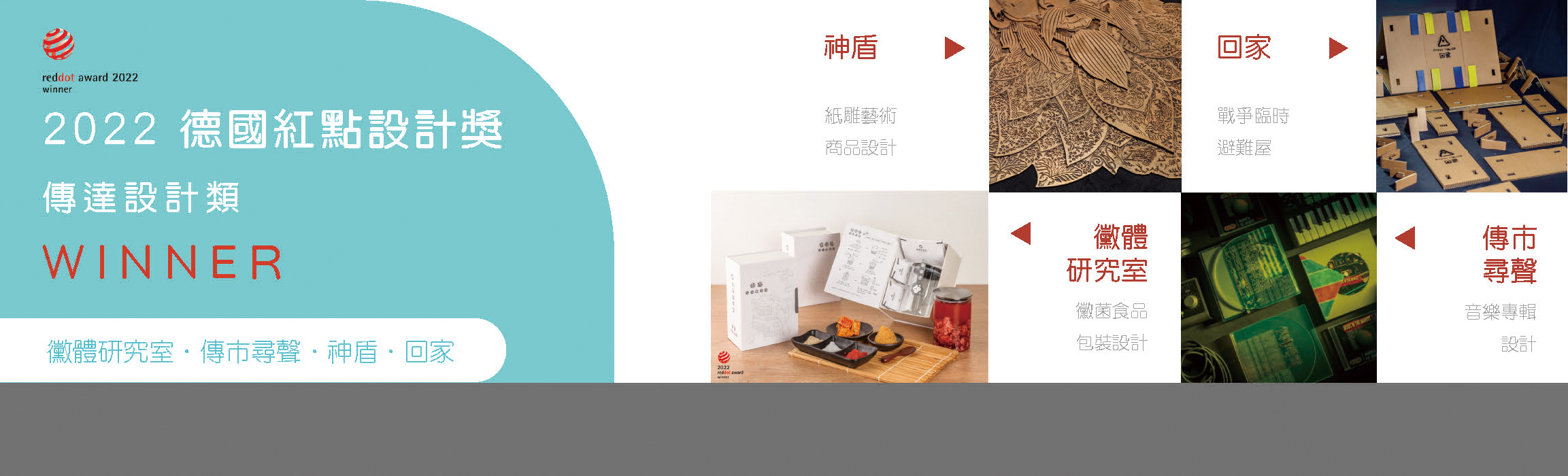
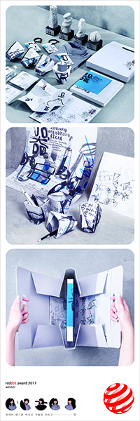
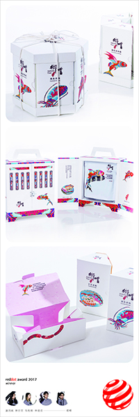
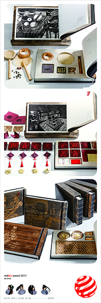
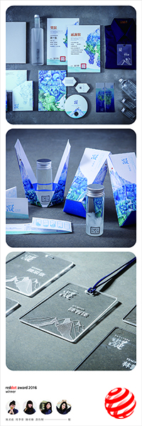
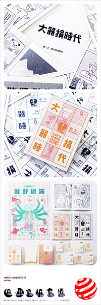
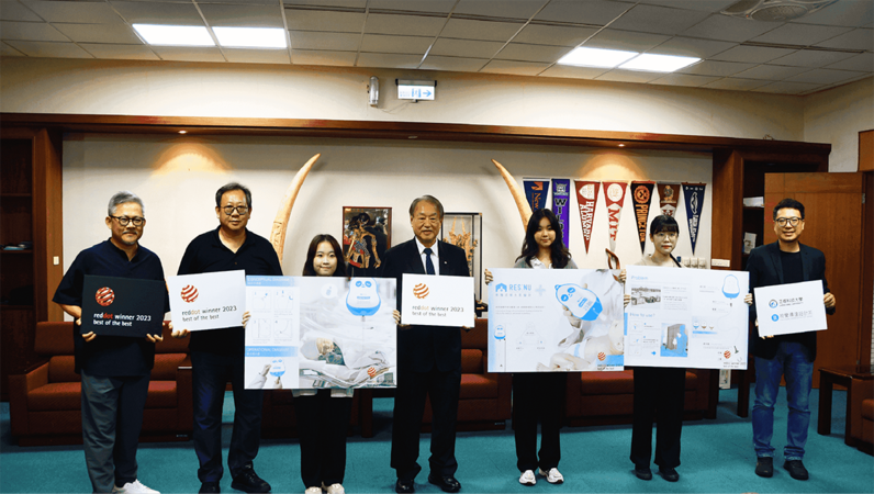
創系14年獲獎無數的正修科大視覺傳逹設計系首度拿下德國紅點設計獎──best of the best,獲獎師生今天將這項榮耀呈獻給校長龔瑞璋,龔校長對視傳系能拿到這麼獨特的獎,連連稱好,真是不簡單。
影片專區
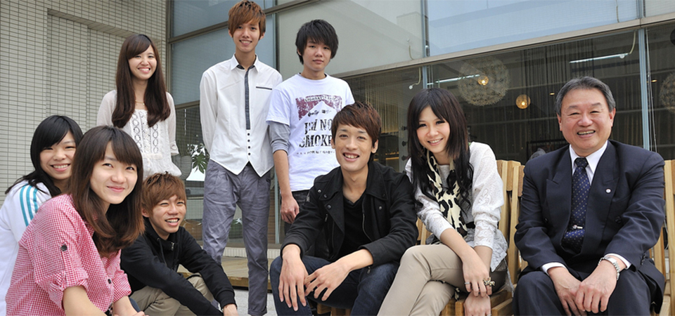
本系介紹
提供「品牌與溝通設計」、「產品工藝研發」及「智慧與數位媒體應用」領域的發展鍊結。
課程規劃重於徒手繪畫表現技法、專業創作工坊實務操作與進階數位影音應用,
再結合行銷企劃之概念,使設計創意轉化為具備產能之優質商品。
課程規劃重於徒手繪畫表現技法、專業創作工坊實務操作與進階數位影音應用,
再結合行銷企劃之概念,使設計創意轉化為具備產能之優質商品。
本系教學與實務並重,除了加強學員設計基礎技能外,並設置設計專業工坊
進行實務操作課程,課程囊括數位電腦繪圖與多媒體應用、金工飾品、木工、
創意公仔、品牌形象與包裝設計…等多元課程。
可繼續在國內外的產品設計、金屬工藝設計、應用藝術、文化創意設計、
視覺設計等相關研究所繼續深造。
學生畢業後的出路寬廣相關產業界之產品開發設計與製作相關部門。
視覺設計等相關研究所繼續深造。
學生畢業後的出路寬廣相關產業界之產品開發設計與製作相關部門。

辦公室:生活創意大樓 27-0801
地址:833 高雄市鳥松區澄清路840號
地址:833 高雄市鳥松區澄清路840號
電話:07-7358800 ext.6510
信箱:vcd@gcloud.csu.edu.tw
信箱:vcd@gcloud.csu.edu.tw