鄉嚐-香腸世家包裝設計|榮獲紅點
|獲獎|
•106級Red Dot Award: Communication Design 2017 – Winner
|入圍|
•2017金點新秀設計獎-廠商贊助特別獎 包裝設計類
•2017金點新秀設計獎-廠商贊助特別獎 視覺傳達設計類
•2017放視大賞-平面類
•106級ADOBE卓越設計大賽
學 生:謝靖純、吳柏穎、林建甫、林竹萱
指導老師:陳江富、賴岳興、曹耀鈞
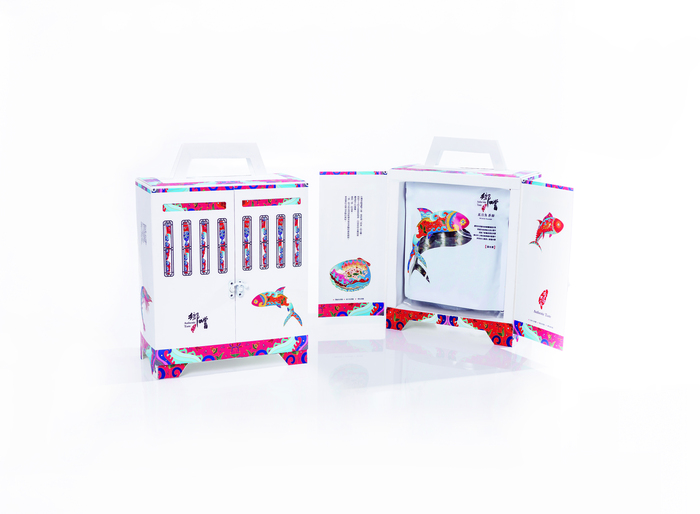
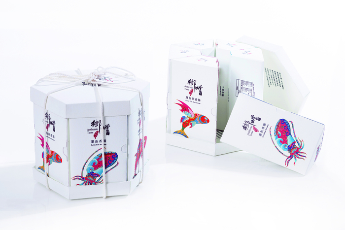
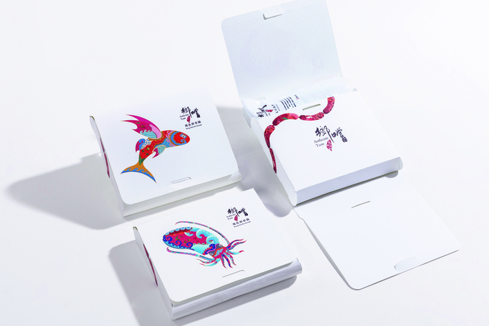
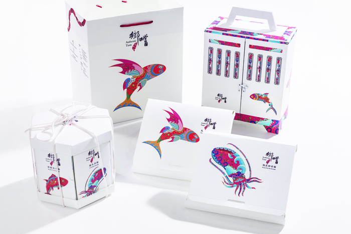
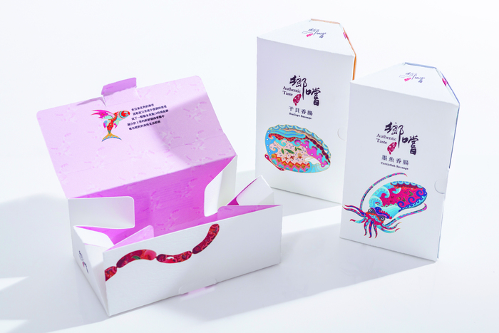
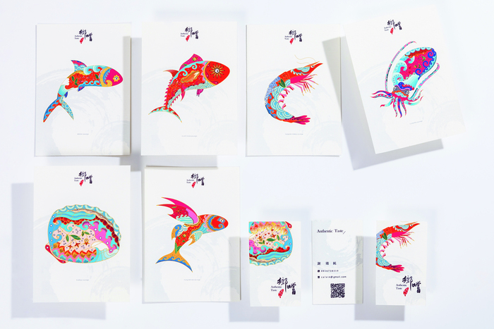
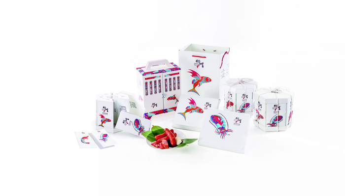
本專題與品牌「香腸世家」合作,製作一系列海鮮香腸包裝。視覺上選擇了海鮮做為插圖呈現,將海洋與自然元素融入插圖當中,與白底做搭配,傳達食品的新鮮純粹。標準字透過書法營造多變寫意的字型,並融入台灣意象,結構上則加入香腸傳統意象,設計符合顧客需求的包裝,我們將以往烘乾香腸的烘束爐擬真後設計成香腸禮盒,結合香腸形體,以圓弧形呈現之單包裝,三支裝則是六個梯形連結成圓,有圓滿的意象,加入上下蓋成為綜合禮盒。
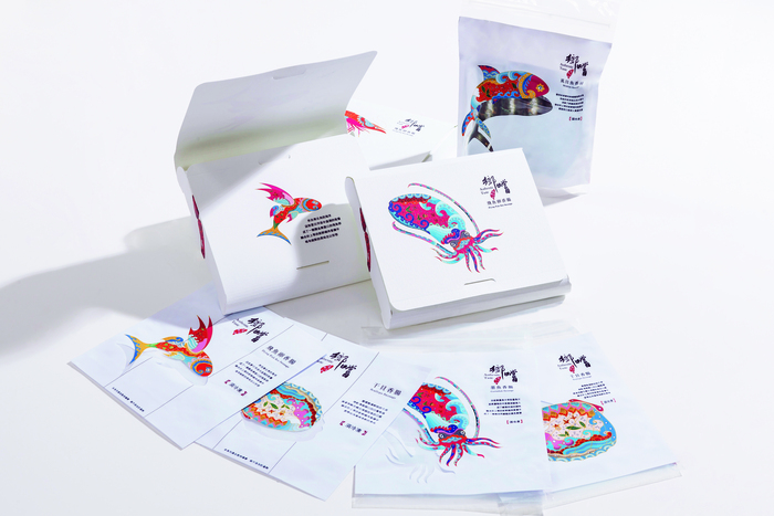
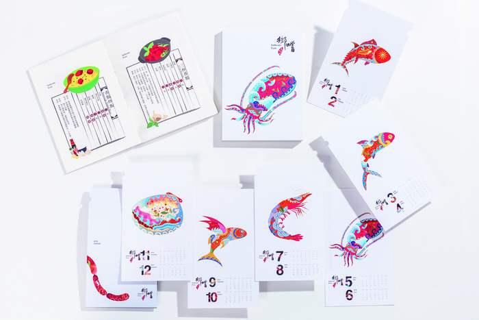
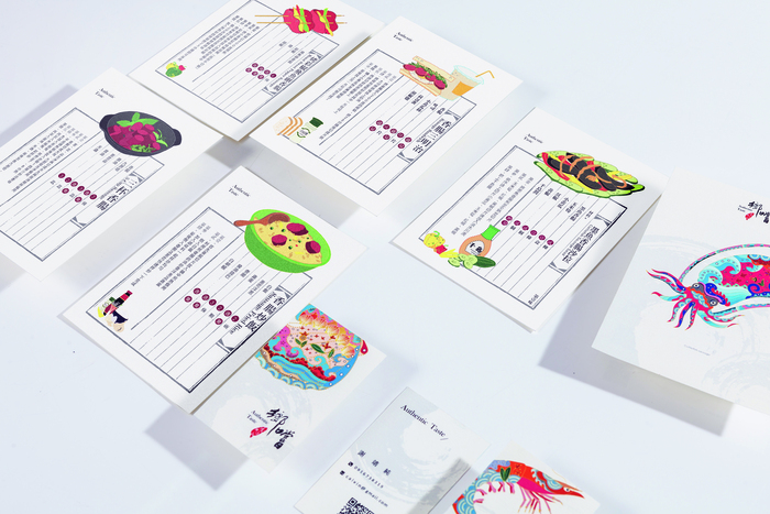
我們也設計富有特色的真空袋、紙袋、名片、酷卡、食譜、月曆。為了讓海外也能品嚐台灣的傳統美食,我們將香腸包裝導向精緻化,傳達台灣香腸無與倫比的美味,讓品牌再次在香腸界發光發亮。
Authentic Taste
"These spread the taste of Taiwanese sausages which is second to none and reinvigorate the brand into the sausage market."
We collaborated with "Sausage Family" and designed a series of packaging for seafood sausage. We also used traditional shape of six side drying furnaces which used to dehydrate sausages in the past as the origin of inspiration. Visually, we chose various seafood illustrations in front of a white background to convey a sense of freshness and purity.