雪萃 – 台灣雪山茶包裝設計
|入圍|
•A+新秀設計競賽-時尚設系類
•2017放視大賞-平面類
•106級ADOBE卓越設計大賽
學 生:洪庭輝、林毅銘、陳俊安、楊雅晴、孫莉棋、呂松青
指導老師:黃郁升
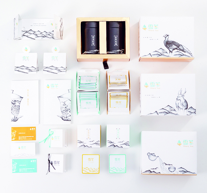
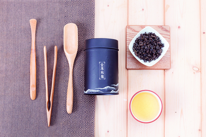
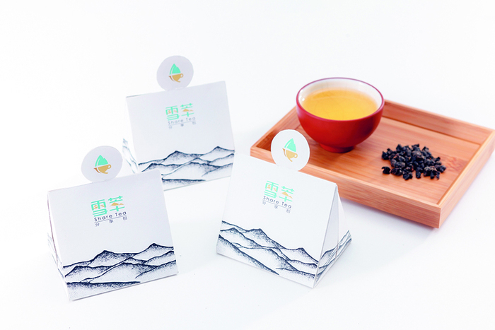
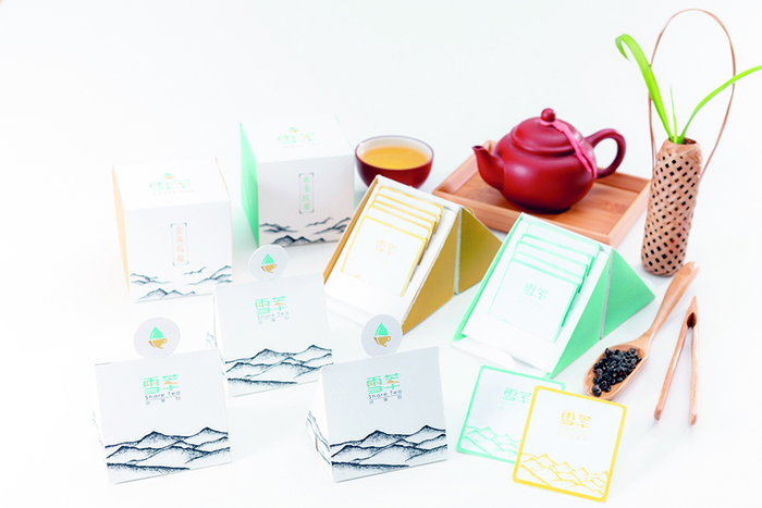
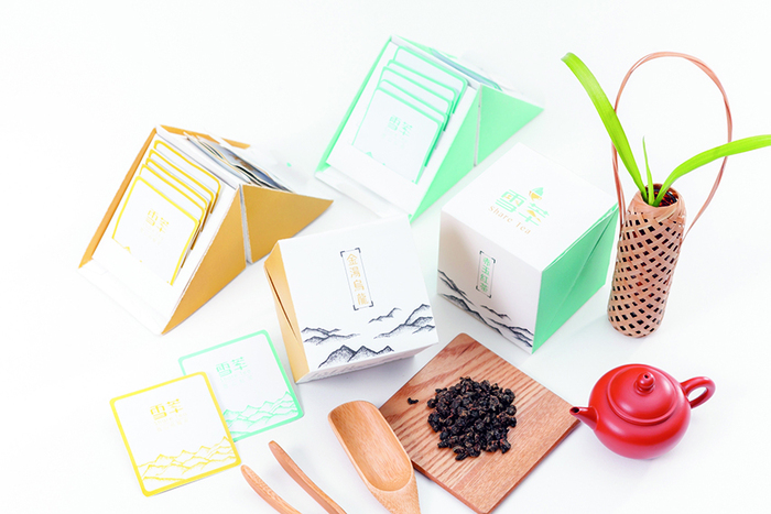
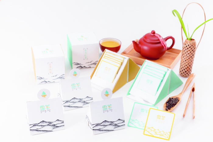
雪萃是一個來自雪山山脈的茶葉品牌,「雪」是雪山,「萃」是指從雪山山脈萃取出來的茶因此名稱定為「雪萃」。以新的品牌形象結合包裝設計,透過清新的配色與包裝設計,貼近年輕族群。希望打破消費者對茶葉公版包裝的刻板印象,包裝強調山、 情 、茶「山」指雪山山脈、特有動植物生態、「情」指與人喝茶的情感交流,「茶」指茶的品種、茶湯。
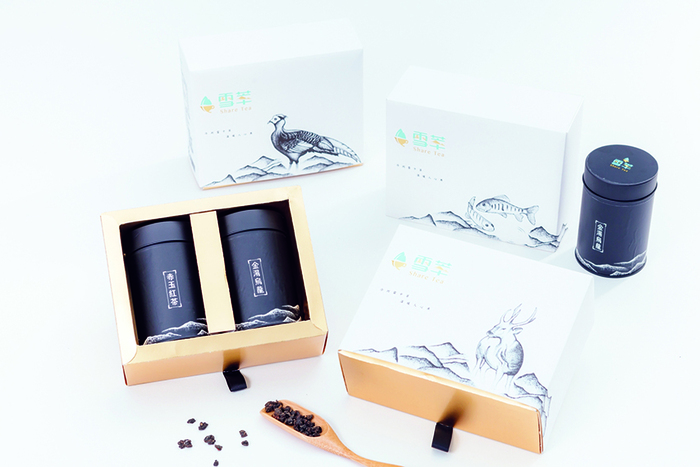
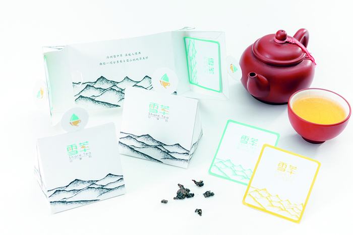
標誌設計將雪山、茶葉、茶杯的圖案融合再一起,插圖以手繪點描將雪山山脈特有動植物與人喝茶談天景象與包裝結合。禮盒以抽屜式方盒呈現。茶包禮盒及分享包則以「山」發想設計,側面呈現山的形狀。分享包在結構展開後能看到「冷冽雪中萃,溫暖人情沸」等文字,呼應品牌想傳達的精神。
Share Tea
"Extracted from the coldness of the snow, boiled by the warmth of human relationships."
With excellent water resources rich in minerals, a unique alpine climate and traditional tea-brewing crafts passed down from generation to generation, the tea from Taiwan's Xueshan Ridge (literally "snowy mountains") is outstanding in quality. While consumers may find tea leaf packages which look similar, this project aims to break this stereotype by blending the cultural and geographical traits of the Xueshan Ridge and affectional interactions of tea drinkers into the packaging of the tea leaves of Share Tea, a tea brand inspired by the Xueshan Ridge. Its Chinese name, Xuecui, means "snow extract", a very fitting name for tea extracted from the snowy Xueshan Ridge.